前言
Hexo框架很漂亮。但太不稳定。经常敲错一个字符就无法生成。因为毕竟不是自己写的,debug浪费了很多时间。还是自己写一个主题吧。暂时先决定,用开源的Jekyll博客模板框架,加上Bootstrap样式框架来搭博客。这篇先复习一下前端的基础: “HTML5页面 + CSS3布局 + JavaScript渲染” 老三样。很久没用了。
最简单的HTML静态页面
没有比这个更简单的HTML页面了。但写出这个,其实基本已经知道HTML是怎么回事了。
<!DOCTYPE html>
<html>

<head>
    <meta charset="utf-8">
    <title>最简单的静态html页面</title>
</head>

<body>
    <h1>分享原创读书笔记,欢迎交流^3^</h1>
</body>

</html>
加上最简单的布局
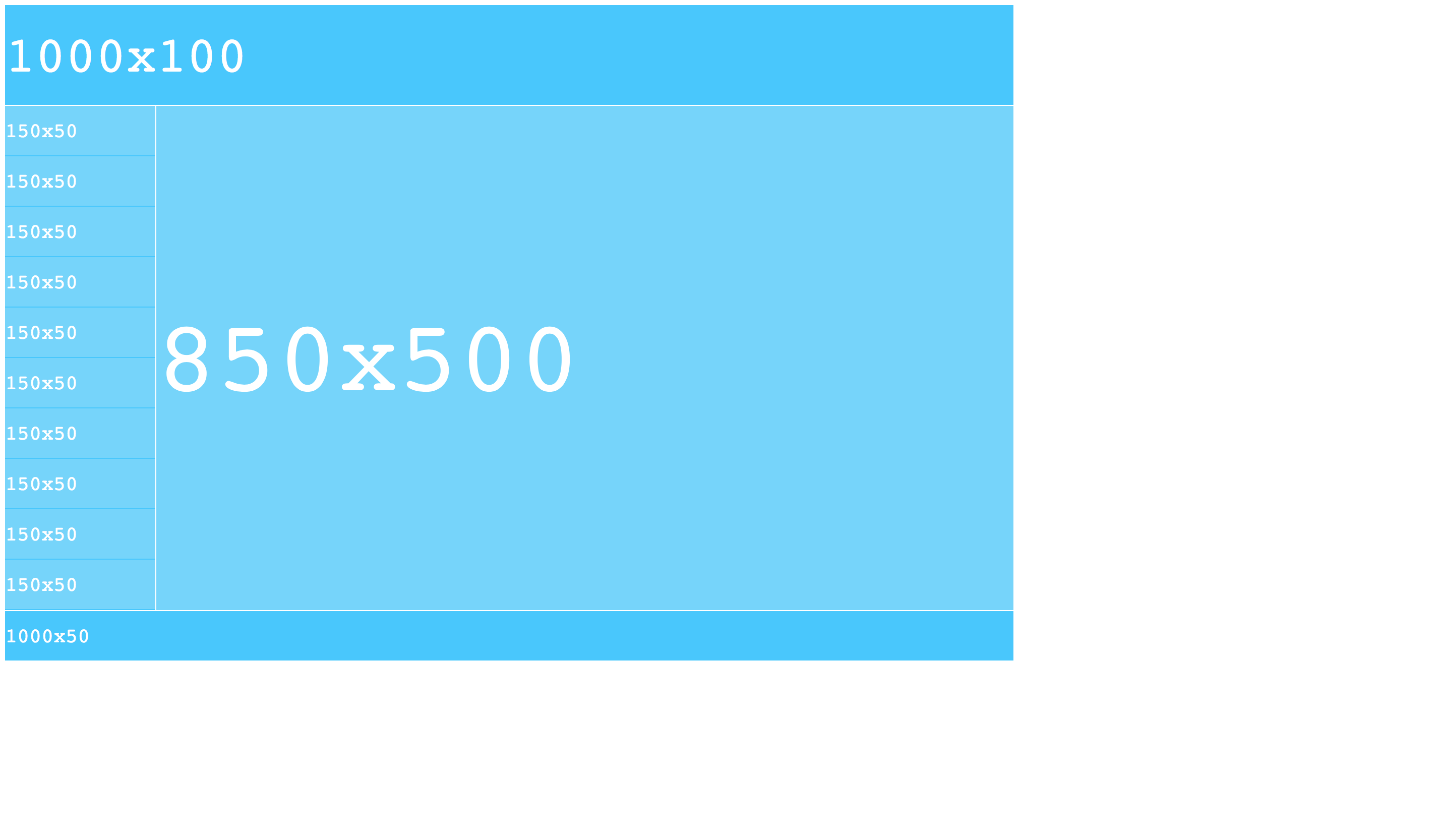
HTML + CSS是一对好基友。 把排版,布局,样式的工作交给CSS来做吧。效果如下:
<!DOCTYPE html>
<html>

<head>
    <meta charset="utf-8">
    <title>最简单的静态页面布局</title>
    <style type="text/css">
        @import "../css/simpleHtmlDiv.css";    /* static width and heigth */
    </style>
</head>

<body>
    <div class="container">
        <div class="header">
            <span>1000x100</span>
        </div>
        <div class="middle_part">
            <div class="menu">
                <div class="menu_button"><span>150x50</span></div>
                <div class="menu_button"><span>150x50</span></div>
                <div class="menu_button"><span>150x50</span></div>
                <div class="menu_button"><span>150x50</span></div>
                <div class="menu_button"><span>150x50</span></div>
                <div class="menu_button"><span>150x50</span></div>
                <div class="menu_button"><span>150x50</span></div>
                <div class="menu_button"><span>150x50</span></div>
                <div class="menu_button"><span>150x50</span></div>
                <div class="menu_button"><span>150x50</span></div>
            </div>
            <div class="content"><span>850x500</span></div>
        </div>
        <div class="footer">
            <span>1000x50</span>
        </div>
    </div>
</body>

</html>
<!--最经典的简单首页布局-->
div {
    text-align: center;
    box-sizing: border-box; /* static width and heigth */
    -moz-box-sizing:border-box; /* Firefox */
    -webkit-box-sizing:border-box; /* Safari */
}

div span {
    font-family: Courier;
    color: white;
}

div.container {
    height: 700px;
    width: 1000px;
}

div.header {
    height: 99px;
    width: 1000px;
    margin-bottom: 1px;
    background-color: #41c6ff;
}

div.header span {
    line-height: 99px;
    font-size: 50px;
}

div.middle_part{
    height: 500px;
    width: 1000px;
}

div.menu {
    height: 500px;
    width: 149px;
    float: left;
    margin-right: 1px;
    background-color: #41c6ff;
}

div.menu_button {
    height: 49px;
    width: 149px;
    margin-right: 1px;
    margin-bottom: 1px;
    float: left;
    background-color: #72d3fc;
}

div.menu_button span {
    line-height: 49px;
    font-size: 20px;
}

div.menu_button:hover {
    background-color: #41c6ff;
}

div.content {
    height: 500px;
    width: 850px;
    float: left;
    background-color: #72d3fc;
}

div.content span {
    line-height: 500px;
    font-size: 100px;
}

div.footer {
    height: 49px;
    width: 1000px;
    margin-top: 1px;
    background-color: #41c6ff;
}

div.footer span {
    line-height: 49px;
    font-size: 20px;
}
Fluid - “液态布局”,自动充满整个屏幕
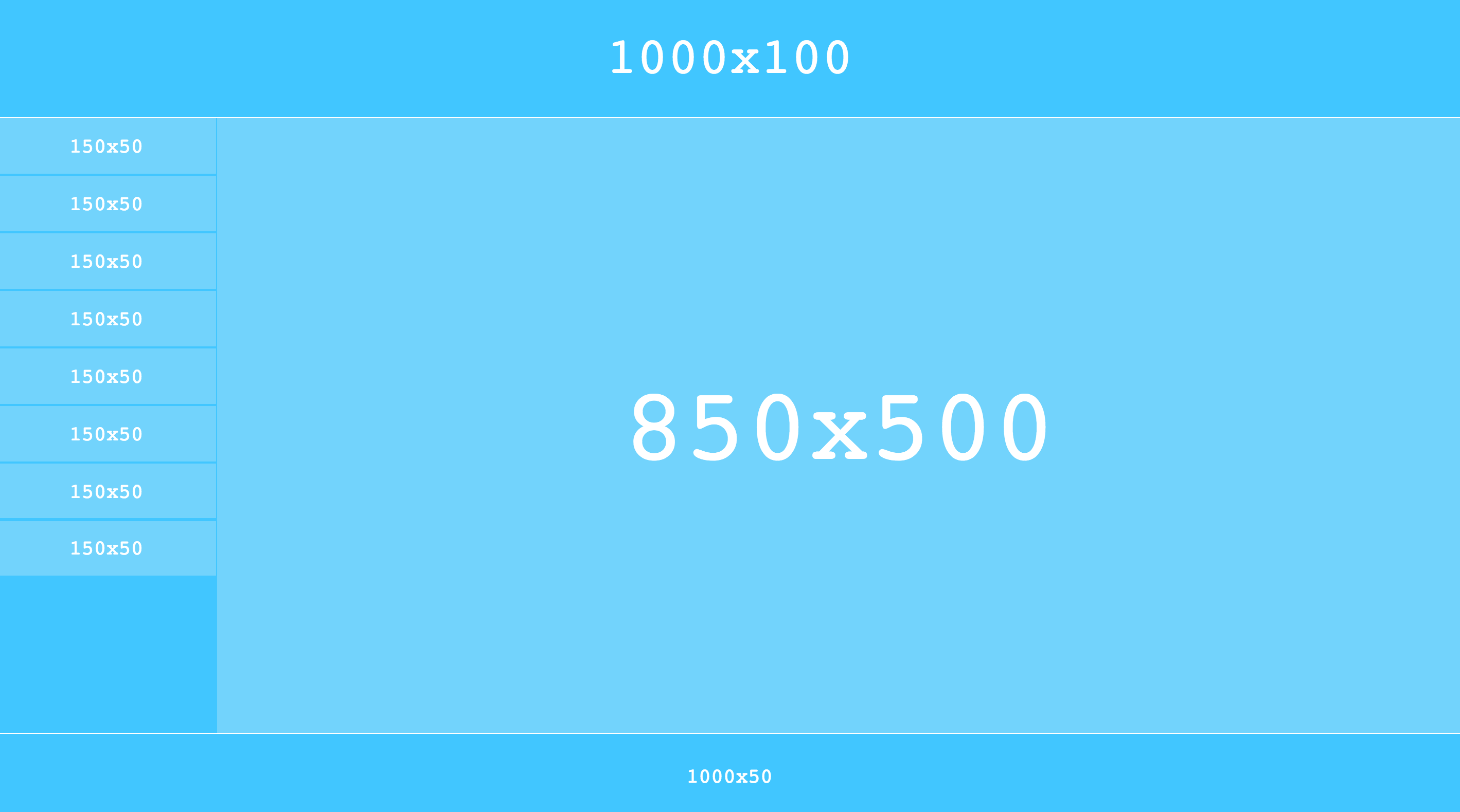
上面的网页一切都是静态的。甚至页面上每个元素的尺寸都是固定写死的。下面代码用百分比的形式替代了之前用固定像素写死的布局样式。使得页面能自适应屏幕大小。网页中的元素就像“液体”一样,随着用户随意调整浏览器窗口的尺寸,可以自动扩展填满浏览器窗口的可用空间。下面的代码只是“液态布局”最最简单的一个演示,效果如下:
<!DOCTYPE html>
<html>

<head>
    <meta charset="utf-8">
    <title>最简单的静态页面布局</title>
    <style type="text/css">
        @import "../css/simpleHtmlDivPercent.css";   /* width and height with % */
    </style>
</head>

<body>
    <div class="container">
        <div class="header">
            <div class="text">1000x100</div>
        </div>
        <div class="middle_part">
            <div class="menu">
                <div class="menu_button"><div class="text">150x50</div></div>
                <div class="menu_button"><div class="text">150x50</div></div>
                <div class="menu_button"><div class="text">150x50</div></div>
                <div class="menu_button"><div class="text">150x50</div></div>
                <div class="menu_button"><div class="text">150x50</div></div>
                <div class="menu_button"><div class="text">150x50</div></div>
                <div class="menu_button"><div class="text">150x50</div></div>
                <div class="menu_button"><div class="text">150x50</div></div>
            </div>
            <div class="content"><div class="text">850x500</div></div>
        </div>
        <div class="footer">
            <div class="text">1000x50</div>
        </div>
    </div>
</body>

</html>
div {
    box-sizing: border-box;
    -moz-box-sizing:border-box; /* Firefox */
    -webkit-box-sizing:border-box; /* Safari */
}

div.text{
    font-family: Courier;
    color: white;
    display: inline-block;  /*以下5行用来水平,垂直居中*/
    position  : relative;
    top       : 50%;
    left      : 50%;
    transform : translate(-50%,-50%);
}

div.container {
    height: 800px; /* the main container must have a real height */
    width: 100%;
}

div.header {
    height: 15%;
    width: 100%;
    background-color: #41c6ff;
}

div.header div.text{
    font-size: 50px;
}

div.middle_part{
    height: 75%;
    width: 100%;
    padding-top: 1px;
    padding-bottom: 1px;
}

div.menu {
    height: 100%;
    width: 15%;
    float: left;
    padding-right: 1px;
    background-color: #41c6ff;
}

div.menu_button {
    height: 9%;
    width: 100%;
    margin-bottom: 1%;
    float: left;
    background-color: #72d3fc;
}

div.menu_button div.text{
    font-size: 20px;
}

div.menu_button:hover {
    background-color: #41c6ff;
}

div.content {
    height: 100%;
    width: 85%;
    float: left;
    background-color: #72d3fc;
}

div.content div.text{
    font-size: 100px;
}

div.footer {
    height: 10%;
    width: 100%;
    padding-top: 1px;
    background-color: #41c6ff;
}

div.footer div.text{
    font-size: 20px;
}
加上JavaScript和jQuery
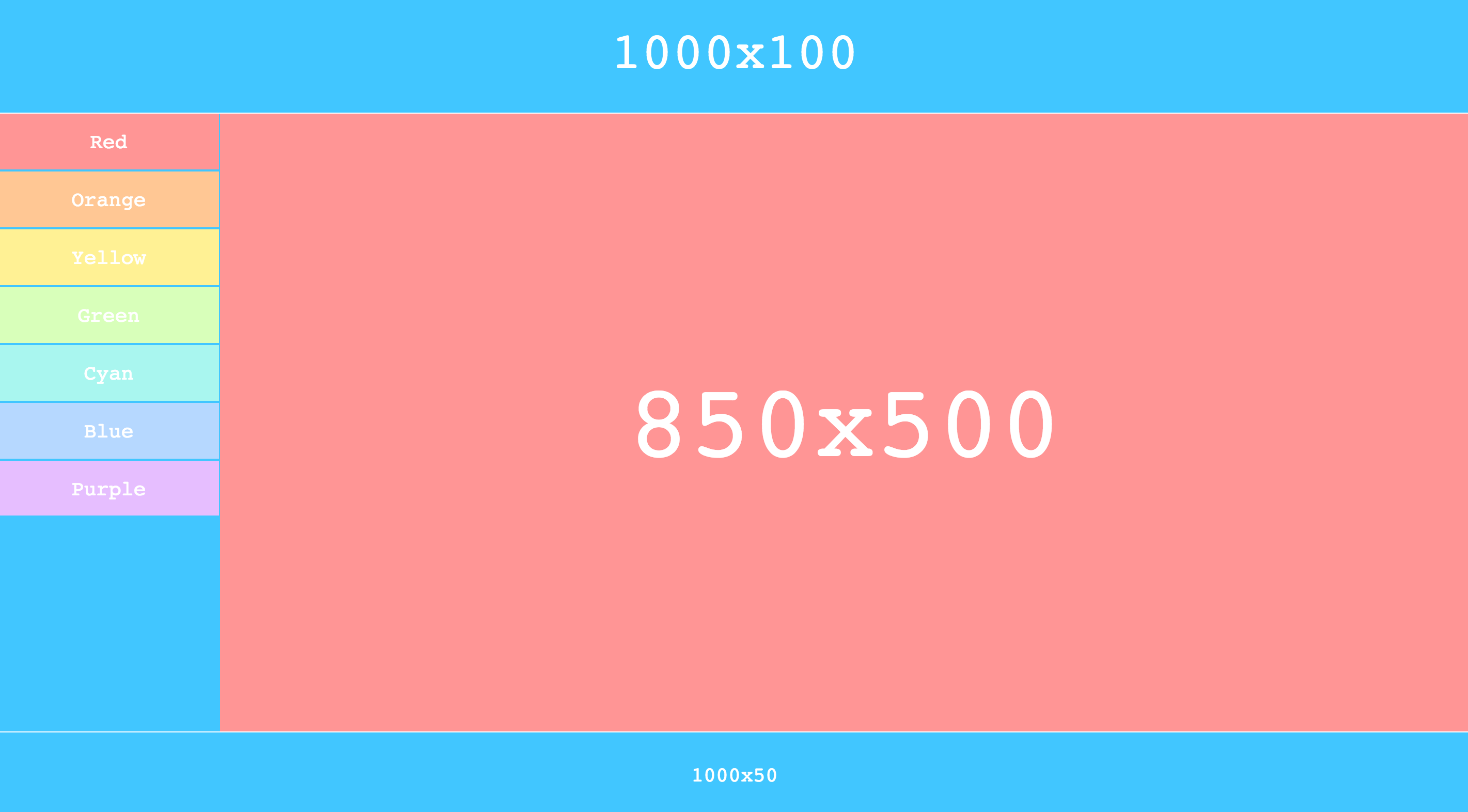
有了一个朴素的静态页面以后,尝试加一点动态交互的内容。用到了JavaScript和jQuery。简单用jQuery做了一个鼠标悬停变色的效果,虽然直接用CSS也能做。只是为了演示JavaScript和jQuery的功能。
<!DOCTYPE html>
<html>

<head>
    <meta charset="utf-8">
    <title>最简单的静态页面布局</title>
    <style type="text/css">
        @import "../css/simpleHtmlDivDyna.css";   /* width and height with % */
    </style>
    <script src="../jquery/dist/jquery.min.js"></script>
</head>

<body>
    <div class="container">
        <div class="header">
            <div class="text">1000x100</div>
        </div>
        <div class="middle_part">
            <div class="menu">
                <div class="menu_button" id="red"><div class="text">Red</div></div>
                <div class="menu_button" id="orange"><div class="text">Orange</div></div>
                <div class="menu_button" id="yellow"><div class="text">Yellow</div></div>
                <div class="menu_button" id="green"><div class="text">Green</div></div>
                <div class="menu_button" id="cyan"><div class="text">Cyan</div></div>
                <div class="menu_button" id="blue"><div class="text">Blue</div></div>
                <div class="menu_button" id="purple"><div class="text">Purple</div></div>
            </div>
            <div class="content"><div class="text">850x500</div></div>
        </div>
        <div class="footer">
            <div class="text">1000x50</div>
        </div>
    </div>
    <script src="../javascript/simple.js"></script>  <!-- execute when document 100% uploads -->
</body>

</html>
>
div {
    box-sizing: border-box;
    -moz-box-sizing:border-box; /* Firefox */
    -webkit-box-sizing:border-box; /* Safari */
}

div.text{
    font-family: Courier;
    color: white;
    display: inline-block;  /*以下5行用来水平,垂直居中*/
    position  : relative;
    top       : 50%;
    left      : 50%;
    transform : translate(-50%,-50%);
}

div.container {
    height: 800px; /* the main container must have a real height */
    width: 100%;
}

div.header {
    height: 15%;
    width: 100%;
    background-color: #41c6ff;
}

div.header div.text{
    font-size: 50px;
}

div.middle_part{
    height: 75%;
    width: 100%;
    padding-top: 1px;
    padding-bottom: 1px;
}

div.menu {
    height: 100%;
    width: 15%;
    float: left;
    padding-right: 1px;
    background-color: #41c6ff;
}

div.menu_button {
    height: 9%;
    width: 100%;
    margin-bottom: 1%;
    float: left;
    background-color: #72d3fc;
}

div.menu_button div.text{
    font-size: 20px;
}

div.content {
    height: 100%;
    width: 85%;
    float: left;
    background-color: #72d3fc;
}

div.content div.text{
    font-size: 100px;
}

div.footer {
    height: 10%;
    width: 100%;
    padding-top: 1px;
    background-color: #41c6ff;
}

div.footer div.text{
    font-size: 20px;
}
$("#red").css("background-color","#ff9595");
$("#red").mouseenter(
    function(){
        $(".content").css("background-color","#ff9595");
    }
);
$("#red").mouseleave(
    function(){
        $(".content").css("background-color","#72d3fc");
    }
);

$("#orange").css("background-color","#ffc794");
$("#orange").mouseenter(
    function(){
        $(".content").css("background-color","#ffc794");
    }
);
$("#orange").mouseleave(
    function(){
        $(".content").css("background-color","#72d3fc");
    }
);

$("#yellow").css("background-color","#fff194");
$("#yellow").mouseenter(
    function(){
        $(".content").css("background-color","#fff194");
    }
);
$("#yellow").mouseleave(
    function(){
        $(".content").css("background-color","#72d3fc");
    }
);

$("#green").css("background-color","#d8ffba");
$("#green").mouseenter(
    function(){
        $(".content").css("background-color","#d8ffba");
    }
);
$("#green").mouseleave(
    function(){
        $(".content").css("background-color","#72d3fc");
    }
);

$("#cyan").css("background-color","#a9f6ef");
$("#cyan").mouseenter(
    function(){
        $(".content").css("background-color","#a9f6ef");
    }
);
$("#cyan").mouseleave(
    function(){
        $(".content").css("background-color","#72d3fc");
    }
);

$("#blue").css("background-color","#b6d8ff");
$("#blue").mouseenter(
    function(){
        $(".content").css("background-color","#b6d8ff");
    }
);
$("#blue").mouseleave(
    function(){
        $(".content").css("background-color","#72d3fc");
    }
);

$("#purple").css("background-color","#e6beff");
$("#purple").mouseenter(
    function(){
        $(".content").css("background-color","#e6beff");
    }
);
$("#purple").mouseleave(
    function(){
        $(".content").css("background-color","#72d3fc");
    }
);
Responsive Design - 响应式设计
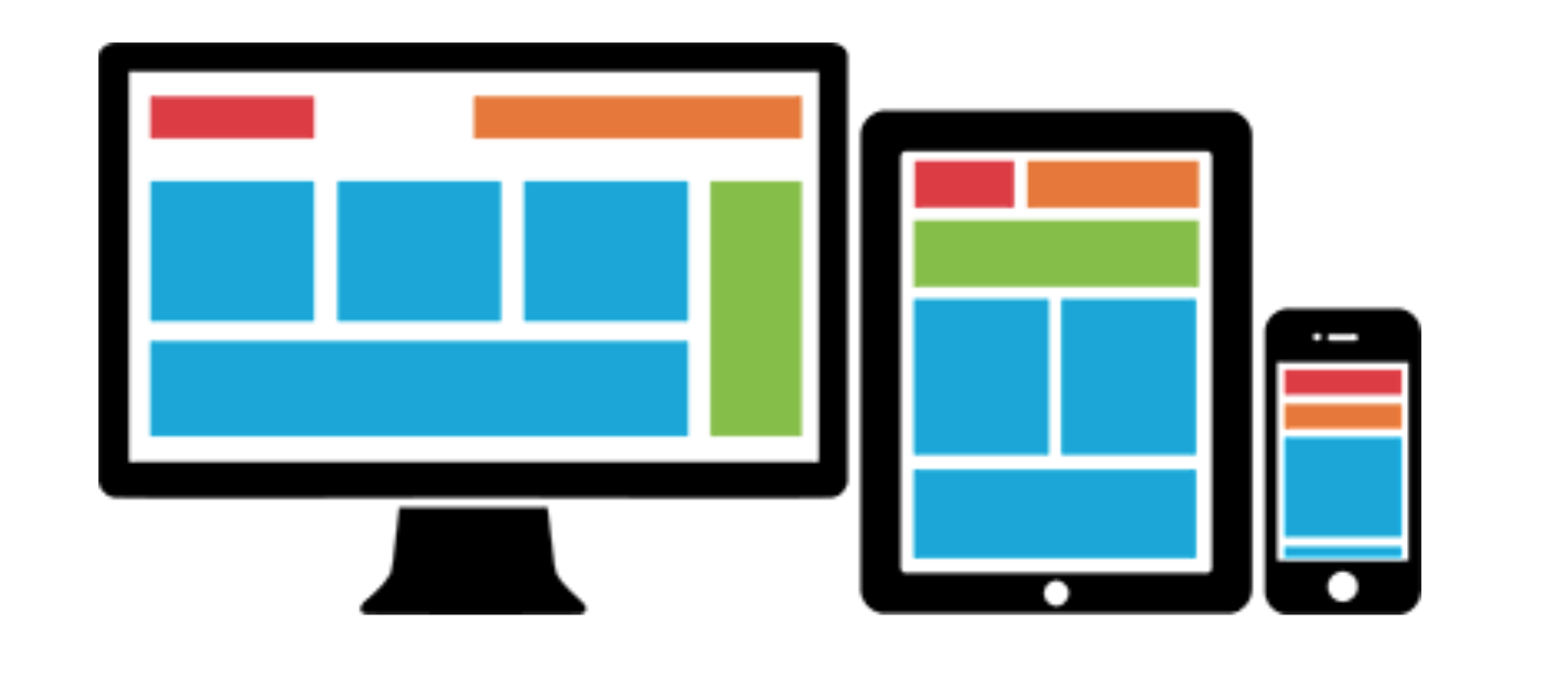
从刚才的“液态布局”,可以引申到 “响应式设计(Responsive Design)” 以及 “移动优先(Mobile First)” 的更高需求。一个健壮的站点需要能适应不同大小的屏幕尺寸。页面可以拆分成相互独立的不同尺寸区块,然后根据终端屏幕的大小来自动堆叠排版。Responsive Gird system(响应式栅格系统)正是应对这种需求的良好解决方案。下图中同一个网站在不同大小的屏幕上会显示出不同的风格。
除了对屏幕大小做出响应调整,一个健壮的站点也要能自适应不同的系统和浏览器。就像上面例子中的一个CSS的简单box-sizing命令,不同的浏览器要求的格式写法不同。
div {
    box-sizing: border-box;
    -moz-box-sizing:border-box; /* Firefox */
    -webkit-box-sizing:border-box; /* Safari */
}
对这第二个问题,通用的解决方案就是像 Sass 或者 Less 这样的 CSS 预处理技术。利用mixin,短短一句@include box-sizing(border-box);就完成了。
HTML+CSS+JavaScript的原理和工作流程对一个合格的全栈程序员那都不叫事儿,分分钟学会。但要“敏捷”地写一个健壮的响应式布局的网站,尤其还要美观。还是很难的。这时候,Bootstrap框架可以帮我们操心CSS布局这些事,可以解放我们的生产力。后端工程师也可以很快搭出漂亮网站。
废话不多说,直接一步步上手Bootstrap。